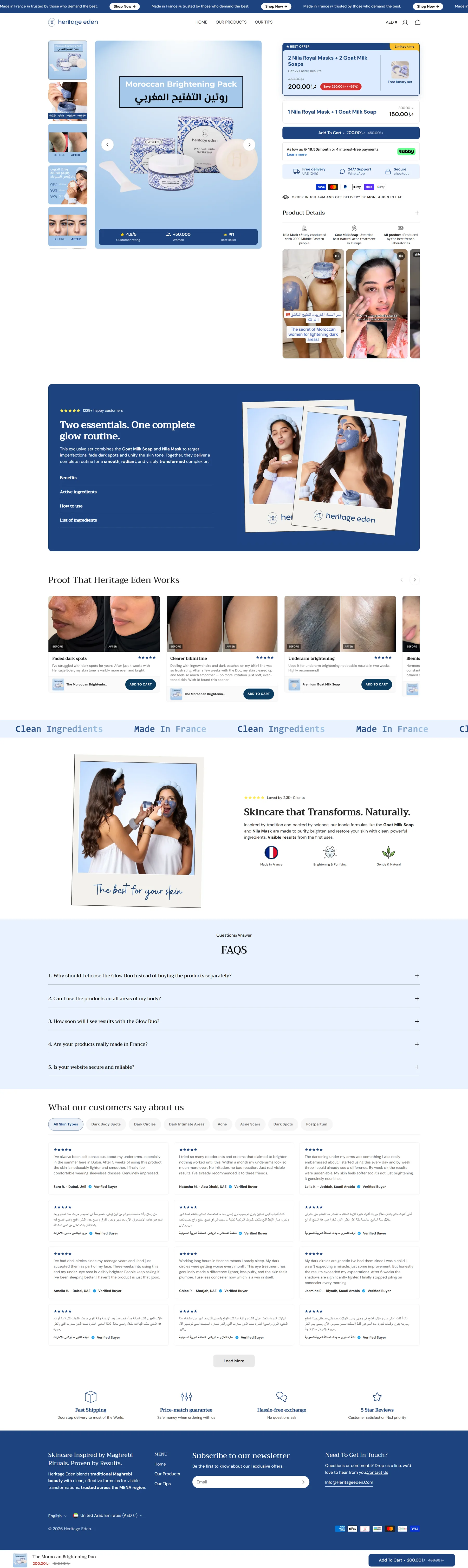

1.1 Bundle Picker
What it is: A UI component on the PDP
that lets shoppers choose between 1-unit, 2-unit, and 3-unit
quantities — typically with a tiered discount (e.g. 1x = $40, 2x =
$36/each, 3x = $32/each). For beauty brands, this takes the form of
a "Build Your Routine" or "Starter Kit" selector.
Why it works: Supplements are consumable
on a fixed clock (30-day supply). A customer who commits to 3 months
reduces churn risk and locks in more revenue. Beauty customers are
buying a routine — not a single product. Showing the bundle is
showing them how to achieve the result, not just selling more units.
Niche notes:
-
Supplements: Volume-discount bundle (1 / 2 / 3
pack) with a "Most Popular" badge on the 3-pack. Pre-select the
2-pack. The logic: a 90-day supply matches the "habit formation"
window — customers who stick 90 days are dramatically more
likely to reorder.
-
Beauty/skincare: "Complete Routine" bundle
(cleanser + serum + moisturizer) or "Starter Kit" presented as a
single product tile with a curated discount. Alternatively, a
"Frequently Bought Together" picker below the main ATC.
Data: Volume bundles lift AOV 20–35% on
average. Elizabeth Mott beauty brand: AOV went from $19 to $44.56
after shifting to routine bundle presentation. Supplement brands
with volume bundles show 2.7x higher LTV vs single-item buyers.
Audit check:
- Is there a multi-pack / bundle option visible on the PDP?
-
Is the highest-value bundle pre-selected (or highlighted as
"Most Popular")?
-
For beauty: is there a "Complete Routine" or "Frequently Bought
Together" section?
1.2 Subscribe & Save
What it is: A toggle on the PDP that lets
customers choose between a one-time purchase and a recurring
subscription with a discount (typically 10–15% off).
Why it works: A subscriber is worth 3–5x
a one-time buyer in LTV. The discount is a small margin trade for a
locked-in revenue stream. For supplements, the product is literally
consumed monthly — the subscription mirrors natural behavior.
Niche notes:
-
Supplements: Default the PDP to subscription
(not one-time). Every top supplement brand does this — AG1,
Ritual, LMNT, Olly. The customer must actively choose to pay
more (one-time) rather than passively accept the subscription.
Messaging: "Subscribe & Save 15% — Skip or cancel anytime."
-
Beauty/skincare: Subscription works best for
consumables (serums, cleansers, moisturizers). Less effective
for occasional-use products (masks, tools). Offer at 10–15%
discount with flexible cadence (30/45/60 days).
Data: Defaulting to subscription
increases enrollment 100–200% vs default-off. Supplement S&S brands:
26% of total sales convert to subscription after optimization.
Monthly subscription churn for supplements: 5–8% average, top brands
under 3%.
Discount sweet spot: 10–15%. Higher
discounts (20%+) attract deal-seekers who cancel after the first
order, tanking LTV.
Audit check:
- Is Subscribe & Save available on the PDP?
-
Is subscription the default-selected option (not one-time)?
-
Is the discount clearly stated in dollar AND percentage terms?
- Is "skip or cancel anytime" prominent (not fine print)?
- Is delivery cadence flexible (multiple intervals shown)?
1.3 Free Shipping Progress Bar
What it is: A dynamic bar in the cart
drawer showing how close the customer is to the free shipping
threshold, with a real-time message ("You're $12 away from free
shipping!").
Why it works: 48% of shoppers abandon
because of unexpected shipping costs — the #1 abandonment reason
globally. A progress bar activates the "magnet effect": when the gap
is small ($5–$25), customers self-motivate to add another item.
Dynamic bars outperform static "Free shipping over $X" banners by
15–25%.
Niche notes:
-
Both niches: Set the threshold 20–30% above the
current AOV. For beauty/skincare (average AOV $52–$72), a
threshold of $65–$85 is typical. For supplements (AOV $30–$65),
$40–$80.
-
The gap must feel achievable — too far and customers pay for
shipping instead of adding items.
-
Pair the bar with a product suggestion widget: "Add this to
unlock free shipping" showing a relevant low-cost add-on.
Data: Setting threshold 20–30% above AOV
lifts AOV 15–30%. 58% of shoppers have added items specifically to
hit a free shipping threshold.
Audit check:
- Is there a free shipping threshold?
-
Is the progress bar visible in the cart drawer (not just at
checkout)?
- Does the bar update in real time as items are added?
- Is there a product suggestion shown alongside the bar?
1.4 In-Cart Upsell / Cross-sell
What it is: A product recommendation
shown inside the cart drawer, typically one item displayed as
"Frequently bought with" or "Complete your routine."
Why it works: By the time a customer
opens the cart, they have made a purchase decision. Suggesting a
complementary product at this point is showing it to the most
receptive audience on the site. The offer should be priced at less
than 25% of cart value — low enough to be an impulse decision, not a
second major purchase.
Niche notes:
-
Supplements: Suggest a complementary SKU (e.g.
bought pre-workout → suggest recovery protein, or bought
collagen → suggest vitamin C serum for absorption).
-
Beauty/skincare: Suggest the next step in the
routine (bought cleanser → suggest toner or SPF).
-
Rule: never show a random "also bought" — relevance is
everything. An irrelevant recommendation actively erodes trust
in all recommendations.
Data: Cart cross-sells convert at 3–8%;
AI-personalized recommendations reach 10%+. A single irrelevant
suggestion causes 52% of shoppers to distrust all recommendations on
the site.
Audit check:
- Is there an upsell/cross-sell in the cart drawer?
-
Is the recommended product genuinely complementary to what's in
cart?
- Is it priced under 25% of cart value?
1.5 Post-Purchase Upsell (One-Click)
What it is: An offer shown on the
thank-you page after checkout — before the confirmation email — that
can be accepted with a single click (no re-entering payment
details).
Why it works: The credit card is already
charged. Payment friction (the biggest barrier to purchase) is
completely eliminated. The customer is in a "purchase high" state —
reduced resistance, elevated willingness to say yes. This is the
highest-converting upsell placement in ecommerce, with zero
abandonment risk.
Niche notes:
-
Supplements: Best offer = subscription upgrade
from a one-time purchase ("Subscribe and save 15% on your next
order — one click to activate"). Converting even 5% of one-time
buyers to subscribers here can double 12-month revenue from that
cohort.
-
Beauty: Best offer = a complementary product at
an impulse price (<$30), or a trial-size add-on.
-
Sequence: show highest-value offer first. If declined, show a
downsell (smaller/cheaper). Stop after two offers.
Data: Post-purchase upsell take rate:
8–15% overall; beauty/wellness brands 10–15%+ for relevant sub-$30
offers. 310 Nutrition (supplements): 30% take rate, +25% AOV. Olly
Vitamins: 25% AOV increase, 63% increase in subscription revenue
from post-purchase subscription upsell.
Audit check:
- Is there a post-purchase upsell offer?
- Is it one-click (no payment re-entry)?
- Is the offer directly related to the original purchase?
- Is it priced at 25–40% of the original order value?
2.1 Mobile PDP Above-the-Fold Layout
What it is: Everything visible on a
mobile screen before the user scrolls. This is the most valuable
real estate on the site.
Why it works: 73% of DTC beauty and
supplement purchases originate on mobile. The decision to keep
scrolling (or bounce) is made in the first 2–3 seconds. If the CTA
isn't visible without scrolling, mobile conversions drop materially.
What must be above the fold on mobile (non-negotiable):
- Product image (hero lifestyle shot)
- Product name
- Price (with subscription/one-time toggle if applicable)
-
Star rating + review count (clickable, anchors to reviews section)
- Add to Cart button OR Subscribe & Save CTA
-
For supplements: key benefit statement ("30-day supply · 3rd-party
tested")
Niche notes:
-
Supplements: Third-party certification logos
(NSF, GMP, USP) in the hero section dramatically increase
credibility for first-time buyers. Ritual puts these in the hero
of every PDP — cited as a core driver of their retention.
-
Beauty: Skin concern tags ("For: dry skin,
sensitive skin") near the product title help shoppers
self-identify immediately.
Audit check:
-
Is the ATC button visible above the fold on a mid-range Android
phone?
- Is the star rating visible without scrolling?
- Is the price visible without scrolling?
-
For supplements: is the key benefit/format statement visible
above fold?
2.2 Sticky Add-to-Cart Bar (Mobile)
What it is: A persistent bar pinned to
the bottom of the screen that appears when the original ATC button
scrolls out of view. Contains product name, price, and a full-width
Add to Cart button.
Why it works: Mobile users scroll
significantly before purchasing. The original ATC button disappears
from view quickly — and when the CTA is gone, the path to purchase
is interrupted. A sticky bar keeps the conversion action one tap
away at all times.
What it should contain:
- Product name (short version)
- Current price (show original crossed out if on sale)
- Star rating + review count ("4.8 ★ · 312 reviews")
- ATC button (full-width, min 56px tap height)
- Optional: low stock text from real inventory ("3 left")
-
Optional: variant selector (for simple variants only; complex
variants open a modal)
Implementation: The bar should slide up
when the original ATC button scrolls out of view — NOT on page load.
200–300ms smooth entrance animation.
Data: Sticky ATC bars produce 8–15% CVR
improvement in controlled A/B tests. Mobile-heavy stores see up to
20% lift in add-to-cart rate. Zipify test on 8-figure Shopify store:
+10% mobile ATC clicks, +9% order CVR at 95% confidence.
Audit check:
-
Does a sticky ATC bar appear when the original button scrolls
out of view?
- Does it contain price + ATC button at minimum?
-
Is the ATC button large enough for reliable mobile tapping (min
56px)?
- Does it trigger on scroll, not on page load?
2.3 Reviews — Photo & Video
What it is: Customer review photos and
videos displayed alongside or within the review section of the PDP.
Why it works: Shoppers cannot touch or
try products online. Visual UGC collapses the imagination gap by
showing the product on real people with real skin, real results.
This is where confidence is built or lost for beauty and
supplements.
Niche notes:
-
Beauty/skincare: Photo reviews showing skin
before/after or product in-use are highest impact. Kate
Somerville added 47 UGC videos + 92 before/after images to 3
PDPs → +23.9% CVR (verified A/B test).
-
Supplements: Videos showing people explaining
their results over time (30-day journey) are highest trust.
Typed reviews from "Sarah, 42, who lost 8lbs in 6 weeks"
outperform generic text.
Data: Shoppers who see customer photos
are 137% more likely to purchase. 9 in 10 consumers more likely to
buy with photo/video reviews. Video reviews can increase CVR by up
to 80%. goPure skincare: video conversion rates of 13–26% with UGC
shoppable videos, 204x ROI.
Audit check:
- Are customer photo reviews visible on the PDP?
-
Are video reviews available (minimum on hero/top products)?
- Is a before/after UGC gallery present?
-
Are photo reviews surfaced at the top of the review section (not
buried)?
2.4 Reviews — Filtering by Skin Type / Concern
What it is: A filter UI above the review
list that lets shoppers sort reviews by skin type, age range,
concern (acne, dryness, anti-aging), or verification status.
Why it works: A 4.8-star average is
meaningless to a 50-year-old with dry, sensitive skin if all
reviewers appear to be 25-year-olds with oily skin. Filtered reviews
let shoppers find people like them — dramatically reducing purchase
uncertainty.
Niche notes:
-
Beauty/skincare: Collect at review submission:
skin type, skin tone/undertone, age range, primary concern.
Display as filter chips above the review list.
-
Supplements: Collect: goal (weight loss, muscle
gain, energy, sleep), age range, gender, time using product.
-
Top implementations: ILIA Beauty (skin type + tone + undertone +
age range), Rhode (age range + skin type + favourite features).
Data: Customers who filtered by skin type
or concern converted up to 1,532% better than unassisted navigation.
Okendo reports 4.2x average PDP CVR uplift across their merchant
base, with filtered attribute reviews as a core mechanism.
Audit check:
-
Does the review submission form collect skin type / concern /
age attributes?
- Is there a filter UI visible above the review list?
- Can shoppers filter by skin type, concern, or age?
2.5 Reviews — Star Rating Placement
What it is: The aggregate star rating +
review count displayed near the product title, clickable, that
anchors to the reviews section.
Why it works: Users scan: title → images
→ price → rating. A clickable star rating anchored near the title is
an instant credibility signal before the user has committed any
reading effort. Burying it below the fold loses the trust boost for
most visitors.
Data: Products with reviews convert 270%
more than products without. Products with 5,000+ reviews see a 296%
lift over zero-review products. Star rating should be below the
product name, clickable, with review count displayed.
Audit check:
-
Is the star rating visible near the product title (above the
fold)?
- Is it clickable (scrolls to reviews section)?
- Is the review count displayed alongside the rating?
-
Is the ratings distribution bar chart shown at the top of the
reviews section?
2.6 Trust Badges — Placement & Type
What it is: Icon/badge row placed
directly below the Add to Cart button. Not in the footer. Not at the
bottom of the page.
Why it works: Placement must match the
moment of maximum hesitation — when the user is deciding whether to
tap "Add to Cart." A guarantee in the footer is seen by nobody. A
guarantee badge directly below the ATC button answers "what if this
doesn't work?" at exactly the right moment.
Badge hierarchy by niche:
| Badge |
Beauty/Skincare |
Supplements |
Priority |
| 30/60-day money-back guarantee |
✅ Essential |
✅ Essential |
#1 |
| Free shipping threshold |
✅ |
✅ |
#2 |
| NSF / USP / GMP / Informed Choice |
❌ |
✅ Essential |
#3 supplements |
| Dermatologist tested |
✅ Essential |
❌ |
#3 beauty |
| Cruelty-free / Vegan |
✅ if applicable |
✅ if applicable |
#4 |
| Secure checkout (SSL lock) |
✅ |
✅ |
#5 |
| EWG Verified / Clean |
✅ if applicable |
❌ |
#6 beauty |
Data: Adding a 30-day money-back
guarantee badge produced a 32% increase in sales (VWO study). NSF
badge near the buy button: +18% CVR; middle of page: +8%; footer: no
measurable impact. Trust badges placed above the fold show 3.4x
higher engagement.
Audit check:
- Is there a trust badge row below the ATC button?
- Is a money-back guarantee prominently displayed?
-
For supplements: is a third-party testing certification
(NSF/GMP/USP) visible?
-
For beauty: is a "dermatologist tested" or relevant
certification visible?
- Are these on the product page (not just the footer)?
2.7 Scarcity & Urgency Signals
What it is: Low stock indicators, limited
availability messaging, or countdown timers that create urgency to
act.
Critical rule: only use real data. Never fake urgency.
Why it works (when real): Genuine
scarcity triggers loss aversion — one of the most powerful purchase
motivators. Sophisticated DTC beauty and supplement shoppers
instantly recognize fabricated urgency, and when they do, they
distrust everything else on the page.
What works:
-
Low stock indicator: "Only 4 left in this size" — triggered from
real Shopify inventory at 5–10 unit threshold
-
Variant-level specificity: "Low stock in Lavender Scent · 14 units
in Peppermint" — not a blanket "low stock"
-
"X sold this month" — real order data, refreshed automatically
-
Countdown timers only for genuine promotions with real end dates
What doesn't work (and actively hurts):
- Evergreen countdown timers that reset on page load
- "Only 3 left!" on products that are always in stock
- Fake "X people viewing" on low-traffic pages
Data: Real low stock indicators increase
CVR up to 17.8%. Fake timers "destroy brand trust faster than they
drive conversions." FTC August 2024 rule: fake reviews and synthetic
social proof carry penalties up to $51,744 per violation.
Audit check:
-
Is the low stock indicator pulling from real Shopify inventory?
-
Is it shown at variant level (specific shade/size/format)?
-
Are any countdown timers tied to real, verifiable end dates?
-
Is there any fake urgency that resets on page refresh? (Remove
immediately)
3.1 LCP (Largest Contentful Paint)
What it is: The time it takes for the
largest visible element (usually the hero product image) to fully
render on screen. This is the metric users feel as "the page
loaded."
Target: Under 2.0s. Under 1.5s is elite.
Above 3.0s is commercially damaging.
Why it works: Slow pages bounce. 53% of
mobile shoppers leave a site that takes over 3 seconds to load.
Every 100ms shaved off load time correlates with ~3.5% improvement
in CVR. Moving from a 5s LCP to a 2.5s LCP can improve mobile
conversions 20–33%.
What causes slow LCP on Shopify (most common issues):
-
Lazy-loading the LCP image — the most common
Shopify theme bug. The hero product image is set to
loading="lazy" by default in many themes. This delays
the LCP image specifically. It should be
loading="eager" with a
<link rel="preload"> in the
<head>.
-
App bloat — each installed app adds JavaScript
and external API calls. The average Shopify store with 8+ apps
adds 2–3 seconds of load time.
-
Unoptimized images — large JPEGs instead of
WebP/AVIF. Shopify CDN auto-converts if you use Liquid image tags
correctly.
-
Unused CSS/JS from theme — large theme
stylesheets that load globally.
How to check: PageSpeed Insights
(pagespeed.web.dev) on mobile. Run on the actual PDP, not the
homepage. Also check Shopify Admin → Online Store → Themes → "View
report."
Data: Shopify stores under 2s LCP convert
at 2.4% vs the 1.4% average. 0.1 second faster = 8.4% more sales.
Audit check:
-
Is the mobile LCP under 2.5s on PageSpeed Insights? (Check the
actual PDP)
- Is the hero product image NOT lazy-loaded?
- Is the image served in WebP format?
- How many apps are installed? Are any unused or redundant?
-
What is the PageSpeed mobile score? (Target 60+; most app-heavy
stores score 20–40)
3.2 App Audit
What it is: A review of every installed
Shopify app to identify which are actively generating revenue and
which are bloat.
Why it works: 78% of store owners don't
identify their apps as the cause of speed problems. Each poorly
coded app can add 500ms–1,000ms. The compounding effect across 8–10
apps can add 3+ seconds to mobile LCP.
Approach:
- List all installed apps
-
For each: what does it do, is it actively used, does it have a
measurable revenue impact?
- Uninstall or replace anything that doesn't pass that test
-
Prefer custom-coded solutions over app-based solutions for
high-impact features (sticky ATC, free shipping bar, review
display)
Data: Removing unused or redundant apps
is consistently the single highest-ROI speed fix on Shopify.
Audit check:
- Total app count: (list all installed apps)
- Apps flagged for removal: (list any clearly unused)
-
Features currently delivered by apps that could be custom-coded:
(list candidates)
4.1 Cart Drawer vs. Cart Page
What it is: A slide-out cart panel
(drawer) vs. navigating to a separate /cart page.
Why it works: The cart drawer keeps the
shopper on the product page — they don't lose their browse context.
Cart pages require a navigation event, breaking the flow.
Data: Cart drawers generate a 3.2x
revenue multiplier vs 2.2x for cart pages (benchmark across 20,000+
Shopify stores). Desktop: drawers win by ~17% in A/B tests. Mobile:
results are mixed (the overlay competes with a small viewport) —
consider a full-screen cart on mobile.
Audit check:
- Does the store use a cart drawer?
-
Does the cart drawer contain: free shipping progress bar, one
upsell, trust badge row?
4.2 Express Checkout Placement
What it is: Shop Pay, Apple Pay, and
Google Pay buttons placed on the PDP ("Buy Now") and at the top of
the cart drawer.
Why it works: These eliminate form entry
— the single most friction-generating step in mobile checkout. On a
phone, typing a full shipping address and credit card number is a
proven conversion killer. Express checkout skips all of it.
Data: Shop Pay users complete checkout at
1.72x the rate of guest checkout. Returning Shop Pay users: 90%+
completion rate vs 30–45% for guest checkout. Apple Pay drives
+22.3% average conversion increase on mobile.
Audit check:
-
Are Shop Pay / Apple Pay / Google Pay buttons available on the
PDP?
-
Are they positioned above the standard checkout button in the
cart drawer?
- Is "Buy Now" available as a secondary CTA on the PDP?
4.3 Checkout Trust Signals
What it is: SSL/secure checkout badge,
payment method logos, money-back guarantee reminder, and one-line
returns policy on the checkout page.
Why it works: 18% of checkout abandonment
is caused by security concerns. By this point the customer has
emotionally decided to buy — these signals prevent last-second
rationalization from killing the order.
Audit check:
-
Is there a trust badge / secure checkout indicator on the
checkout page?
-
Are recognized payment logos visible (Visa, MC, Amex, PayPal)?
-
Is there a money-back guarantee reminder near the checkout
button?
Note: Loud Cart builds Shopify stores. These flows are NOT what we
build — but auditing whether they exist helps frame the client's
situation and may expand scope. If Klaviyo flows are broken or absent,
that's a problem we can flag and optionally fix.
5.1 Abandoned Cart Flow
What it is: Automated emails (and SMS)
triggered when a customer adds to cart but doesn't complete
checkout.
Why it works: Cart abandonment rate is
71% industry-wide, 80%+ for beauty. Recovering even 10% of abandoned
carts is often more valuable than a 20% traffic increase.
Optimal structure:
-
Email 1: 1–4 hours after abandonment. Product
reminder, no discount. Catches genuine "I got distracted"
abandoners.
-
Email 2: 20–24 hours. Social proof — show reviews
from customers with similar profile.
-
Email 3: 48–72 hours. Discount or urgency (only
if needed — don't train customers to abandon for discounts).
-
SMS: 30–60 minutes after abandonment. Short,
direct, link back to cart.
Data: SMS abandoned cart recovery: 15–25%
recovery rate. Three-email sequences produce 6x the revenue of
single-email approaches. Klaviyo abandoned cart average placed order
rate: 3.33%.
Audit check:
- Is there a Klaviyo abandoned cart flow set up?
- Is SMS abandoned cart recovery active?
- Does the sequence have at least 2 emails?
- Is the first email being sent within 4 hours?
5.2 Post-Purchase Education Sequence
Supplements: A 4–6 email sequence triggered after
first purchase, covering: day 1 (what to expect), day 7 (how the
ingredient works), day 21 (most customers notice X at this point),
day 30 (reorder prompt). The goal is to pre-frame realistic results
timelines so customers don't cancel before they see the effect.
Beauty/skincare: A 3–4 email sequence covering:
where the product fits in their routine, what the key ingredient
does and why, expected adjustment period (e.g. retinol purge), day 7
skin check-in.
Why it works: The most common supplement
subscription cancellation reason is "I didn't see results." An
educational sequence that sets a realistic timeline prevents this
objection before it forms.
Data: Freshly Cosmetics grew
post-purchase flow revenue 136% with tailored Klaviyo sequences.
Supplement brands with education flows see measurably lower churn in
months 2–3 (highest-risk cancellation window).
Audit check:
- Is there a post-purchase email sequence in Klaviyo?
-
For supplements: does it set expectations for when results
appear?
-
For beauty: does it explain where the product fits in a routine?
-
Is a review request included at the 5–7 day post-delivery mark?
5.3 Replenishment / Winback Flow
What it is: An automated email triggered
when a customer is approaching the end of their product supply (for
one-time buyers) or hasn't purchased within a defined window (for
lapsed customers).
Timing by product:
-
Supplements: replenishment prompt at day 25–28 (before the 30-day
supply runs out). Winback if no repurchase by day 60.
-
Skincare: replenishment varies by product (cleanser = 45 days;
face oil = 90 days; SPF = 45 days). Winback at day 90–120.
Data: Supplement repeat purchase rate:
37.7%. Customers who place a second order within 60 days of the
first are 3x more likely to become long-term customers.
Audit check:
-
Is there a replenishment flow calibrated to actual product
consumption?
- Is there a winback flow for lapsed customers?
-
Does the winback email reference what they bought and ask if
they ran out?
6.1 Before/After Imagery
What it is: Real customer photos or video
showing the state before using the product and after — with skin
type, concern, and timeframe attributed.
Why it works: Claims can be copied by any
brand. Evidence cannot. In beauty and supplements, outcome proof is
the ultimate purchase motivator. "Week 1 / Week 4 / Week 8"
progression photos for skincare, or "day 30 progress" for
supplements, are the highest-trust content type in both categories.
Placement: Below the ATC button, in a
dedicated gallery section — NOT as the hero image on mobile (mobile
before/afters tested -27% RPV when used as hero images).
Data: Before/after content increased page
click-throughs by 7.93% and RPV by 17.61% on desktop. Kate
Somerville + Hue: 92 before/after images → +23.9% CVR.
Audit check:
-
Is there a before/after section on the PDP (for applicable
products)?
-
Are images sourced from real customers with skin
type/age/timeframe attributed?
-
Is the placement below the ATC button (not as the hero image on
mobile)?
6.2 UGC Video Gallery
What it is: A swipeable video gallery on
the PDP containing short customer review videos (30–60 seconds
each), positioned between the product info section and the text
review section.
Why it works: 66% of US consumers say
video is their preferred format for product discovery. Video shows
texture, application, and real emotional reaction — all uniquely
powerful in beauty and supplements.
Audit check:
- Is there a UGC video gallery on the PDP?
-
Is it positioned below the product specs, above the text
reviews?
-
On mobile: is it a swipeable vertical format (not autoplay)?
- Does the top SKU have at least 5–10 video reviews?
6.3 "Sold X This Month" / Aggregate Social Proof
What it is: Text like "2,400+ customers
served" or "Sold 800+ units this month" placed in the PDP hero or
near the ATC button.
Why it works: Provides crowd validation
for new visitors. "Sold 800 this month" implies real customers made
a real decision and presumably got results. More credible than
"10,000 happy customers" that never updates.
Real data only. This number must come from actual Shopify order
data, refreshed regularly.
Audit check:
-
Is aggregate social proof visible on the PDP (near the top)?
- Is the number real and regularly updated?
-
Is it specific ("800 sold this month") rather than vague
("thousands of customers")?
7.1 Loyalty Program (Beauty Brands)
What it is: A points-based loyalty
program where customers earn points for purchases, reviews, and UGC,
redeemable for discounts or free products.
Why it works: Beauty consumers have high
brand affinity. Tier progression creates aspiration. Review/UGC
incentives generate the content that converts future customers — a
compounding flywheel.
Tier structure: Three tiers (e.g. "Glow /
Radiance / Luminous") with clear milestones. Bonus points for: first
purchase, leaving a photo review, referring a friend, following on
social.
Data: 83% of consumers say loyalty
programs directly influence their decision to make repeat purchases.
DTC beauty brands with loyalty programs see 20–30% increases in
retention. Repeat customers spend 67% more than first-time buyers.
Audit check:
- Is there a loyalty/rewards program?
-
Does it award points for reviews and UGC (not just purchases)?
- Is tier progression visible and aspirational?
7.2 Subscription Management Portal (Supplements)
What it is: A self-service portal where
subscribers can skip, pause, swap, or reschedule their order without
contacting support.
Why it works: Most subscription
cancellations are not "I don't want this anymore" — they're "I have
too much right now." A skip or pause option prevents those
cancellations. If the customer must contact support to pause, they
cancel instead because it's easier.
Data: Self-service subscription
management reduces voluntary churn by 15–25%. "Skip next order" is
the most-used feature; without it, customers cancel.
Audit check:
-
Can subscribers skip, pause, or swap without contacting support?
-
Is the subscription portal easy to find (link in every order
confirmation email)?